
So, how do you actually post a carousel on LinkedIn? It's simpler than you might think. You just create a multi-page PDF and upload it using the "Add a document" option when you start a new post. LinkedIn then automatically turns each page of your PDF into a swipeable slide.
This creates a really interactive experience for your audience and has totally replaced the old, clunky native image carousel. It's now the go-to method for this super high-engagement format.
Why LinkedIn Carousels Work So Well
Before we get into the nitty-gritty of creating one, let's talk about why carousels are basically a must-have for anyone serious about LinkedIn. Their success isn't just a fluke; it’s baked into how they appeal to both people and the platform's algorithm.
Think about it: a carousel makes people stop and interact. That simple act of swiping keeps them on your post longer. This increased dwell time is a huge green light for the LinkedIn algorithm, signaling that your content is valuable and should be shown to more people. We dive deeper into this in our guide on boosting your impressions on LinkedIn.
A Perfect Format for Storytelling and Data
I see top consultants and industry leaders use carousels all the time to break down really complex ideas into simple, digestible slides. Each page becomes a mini-chapter, guiding the reader through a story that’s way more memorable than a wall of text.
A great carousel does more than just share information—it takes your audience on a journey. It hooks them with a problem, delivers value with each swipe, and wraps up with a clear takeaway or call to action. That's how you make a message stick.
And the numbers don't lie. The data on this is pretty clear. Recent stats show carousels have an average engagement rate of 6.60%, which puts them at the very top of the content performance chart.
In fact, multi-image carousels can pull in 278% more engagement than video posts and an incredible 596% more than a simple text update. You can dig into more stats on LinkedIn carousel performance from PostUnreel. Knowing the 'why' gives you a real strategic advantage, helping you create content that doesn't just get views—it gets results.
Preparing Your Carousel File for a Flawless Post
A great LinkedIn carousel doesn’t just happen. It starts with getting the foundation right long before you even think about hitting that "post" button. Think of it as your pre-flight checklist for making sure your content lands perfectly.
The first, and arguably most important, decision is your file format. While LinkedIn accepts a few different document types, a PDF is the gold standard. It’s the best way to lock in your fonts, colors, and layouts, ensuring your carousel looks exactly as you designed it, no matter what device someone is using. This helps you dodge the frustrating formatting glitches that can sometimes pop up with PPT or DOC files.
LinkedIn Carousel Technical Specifications Checklist
To make sure your file is ready for prime time, I’ve put together this quick-reference table. Keep these specs in mind, and you’ll avoid any uploading headaches.
| Specification | Recommendation | Why It Matters |
|---|---|---|
| File Format | PDF (Portable Document Format) | Ensures consistent formatting across all devices and platforms. |
| File Size | Under 100 MB | Larger files can fail to upload or take too long, frustrating users. |
| Page/Slide Count | Under 300 pages | While you can go this high, the sweet spot for engagement is 5-15 slides. |
| Aspect Ratio | 1:1 (Square) or 9:16 (Vertical) | 1:1 (1080x1080px) is great for all-around visibility, while 9:16 (1080x1920px) maximizes mobile screen space. |
| Resolution | 72-150 DPI | Balances high-quality visuals with a manageable file size for quick loading. |
Following these guidelines ensures your carousel not only looks professional but also provides a smooth, fast-loading experience for your audience.
Designing for the Swipe
Your design choices have a direct line to your engagement rates. Since most people are scrolling LinkedIn on their phones, a mobile-first approach is non-negotiable. I personally lean towards the 1:1 aspect ratio (1080x1080 pixels) because the square format fills the mobile screen nicely, making your content feel immersive and easy to read without any awkward pinching or zooming.
The core principle here is clarity. Dedicate each slide to a single, powerful idea. Stick to your brand colors, choose fonts that are bold and easy to read on a small screen, and keep your text brief. You want every swipe to feel like a mini-reward, not a chore. If you need a hand getting started, an intuitive tool like a LinkedIn carousel generator can be a real time-saver.
It's helpful to think about the psychology behind the swipe. You're not just getting a click; you're starting a journey.
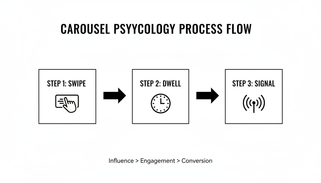
As you can see, that initial swipe is just the beginning. The real magic happens when you keep them engaged, which boosts your dwell time. This is a powerful signal to the LinkedIn algorithm that you've created something valuable.
Crafting a Compelling Narrative
The best carousels aren't just a collection of slides; they tell a story. By structuring your content with a clear beginning, middle, and end, you guide your audience on a logical and satisfying path.
Here’s a simple but effective structure I always come back to:
- Slide 1: The Hook: This is your make-or-break slide. Its only job is to earn that first swipe. Grab their attention with a provocative question, a shocking statistic, or a problem they know all too well.
- Slides 2-9: The Value: Now it’s time to deliver on the promise of your hook. Use these middle slides to unpack your main point. Share data, walk them through a process step-by-step, or break down a complicated idea into bite-sized, digestible pieces.
- Final Slide: The CTA: Never leave your audience wondering what to do next. End with a clear, compelling call-to-action (CTA). You could ask a question to get a conversation started in the comments, prompt them to save the post for later, or point them toward the next step you want them to take.
Your Guide to Uploading a Carousel on LinkedIn
Alright, you've got your beautifully designed PDF ready to go. Now comes the fun part: getting it live on LinkedIn.
This is where most people get tripped up. It feels intuitive to click the "photo" icon, but that's a mistake that will leave you with a clunky, static grid of images. The secret to a native, swipeable carousel is to treat it as a document.
Think of it this way: LinkedIn sees each page of your PDF as a slide in a presentation.
Finding the Right Button
Once you’re on the LinkedIn homepage, click "Start a post" to open the content composer. Ignore the photo and video icons! Instead, look for the option to "Add a document." Sometimes it’s right there, other times it’s hidden behind a plus (+) or "more" menu. This is the magic button.
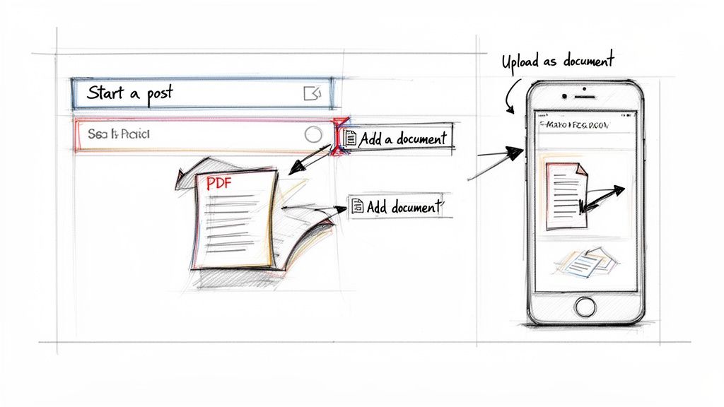
The Upload and Preview Process
Clicking "Add a document" will open your computer’s file browser. Find and select the PDF you created. LinkedIn will then process the file and generate a preview.
This next step is crucial: give your document a descriptive title. Don’t just leave the generic filename like "Final_Carousel_V3.pdf."
A strong title acts as a second headline, grabbing attention and giving people a reason to start swiping. For instance, title it something like “5 Common Mistakes to Avoid in Your Next Sales Pitch.” It’s a small detail that makes a huge difference in how your audience perceives the content before they even start swiping.
Pro Tip: Before you hit publish, always check the mobile preview. With over 70% of LinkedIn engagement happening on mobile, you have to be sure every slide is readable on a small screen. A quick look can prevent you from publishing a carousel with awkward text wrapping or tiny, unreadable graphics.
Once you’ve set your title and are happy with the preview, click “Done.” Your carousel is now attached to the post, ready for you to write that killer caption to reel your audience in.
Writing a Caption That Sparks Conversation
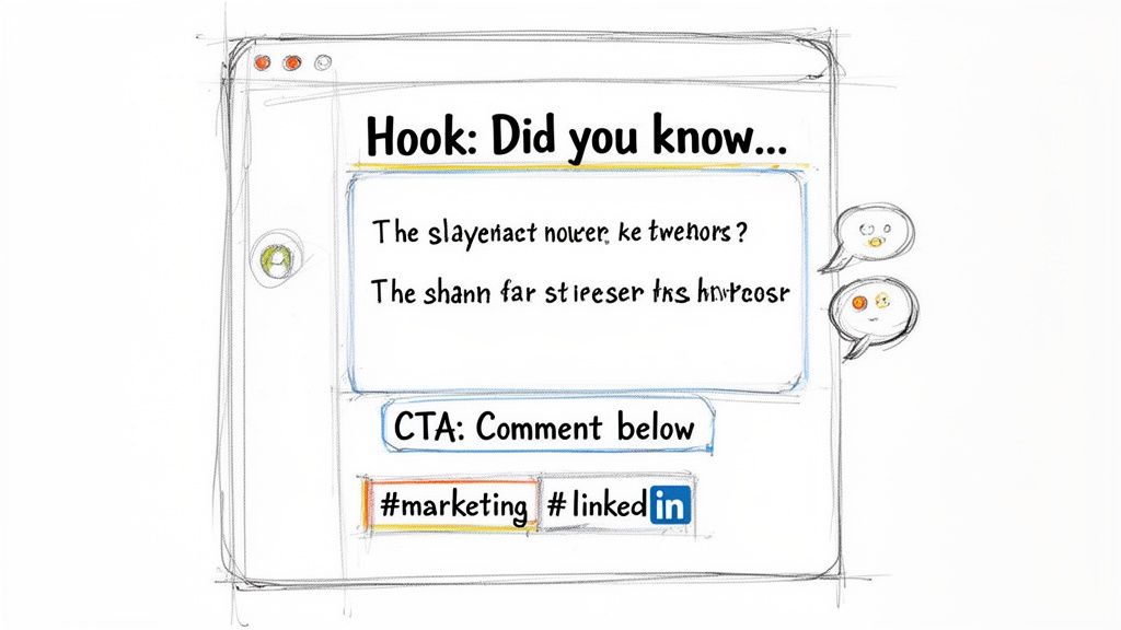
Your carousel might be a work of art, but it's the caption that truly gets the conversation started. Don't treat it as an afterthought; it’s the bait on the hook. Your number one goal here is to spark enough curiosity to get that first swipe.
A great caption does more than just describe the slides. It injects personality, adds critical context, and gives people a compelling reason to stop scrolling and start swiping. The first sentence is everything—make it count. Lead with a provocative question, a surprising statistic, or a pain point your audience knows all too well.
Anatomy of a High-Performing Caption
Once you’ve hooked them, give a little teaser of the value packed inside your slides. You could hint at a key takeaway or frame the carousel as the solution to a nagging problem. The key is to be concise—don’t give away the entire story in the caption.
Finally, wrap it up with a clear and compelling call-to-action (CTA). You have to tell people what you want them to do next. Ask them to share their own experience, save the post for reference, or tag someone who needs to see it. Being direct makes a world of difference.
For instance, here's a caption for a carousel about improving sales outreach:
"Struggling to get replies to your cold outreach?
In these slides, I'm breaking down the 3-step framework that took my response rate from 2% to over 25%. It's simpler than you think.
Which slide resonates with you the most? Let me know in the comments!"
This formula works because it creates a natural path from curiosity to action. It’s effective, too. Visuals like carousels often pull in double the comments of text-only posts. And for those with a high Social Selling Index (SSI), this kind of content can lead to 45% more opportunities. It’s a powerful way to generate leads without the endless grind. For more on this, check out LinkedIn's content trends from ConnectSafely.ai.
Don't forget to sprinkle in a few relevant hashtags. The best approach is to blend broad industry tags (like #marketing) with more specific community tags (like #b2bcontentstrategy). This strategy helps you reach a wider audience while also connecting with the people who will find your content most valuable.
So, How Did Your Carousel Actually Do? Let's Find Out.
Hitting "post" is just the beginning. The real magic happens when you dig into the data to see what actually worked. This isn't about vanity metrics like views; it's about understanding what made people stop scrolling, swipe through, and actually engage with your content. This feedback is gold for your next post.
Don't just look at the dashboard and move on. You're looking for patterns. LinkedIn's built-in analytics are surprisingly powerful if you know what to look for. Are people just liking the post, or are they clicking through to your profile? Are they leaving thoughtful comments? Those are the signs that you’ve truly connected with them.
What to Actually Look For in Your Analytics
To really understand what's resonating, you need to focus on the metrics that show how people are interacting with your carousel, not just how many saw it. This is how you fine-tune your approach for the next one.
-
Slide Drop-Off Rate: Okay, LinkedIn doesn’t give you a direct, slide-by-slide breakdown (we wish!). But you can play detective. Did your 10-slide deep dive get less engagement on the final slide's CTA compared to your punchy 4-slide carousel? If shorter posts consistently get more interaction all the way to the end, it’s a sign your longer content might be losing steam midway.
-
Click-Through Rate (CTR) on Your CTA: Your last slide had a clear call-to-action, right? If you got a ton of views but almost nobody clicked the link in the comments, something's off. It could be that your CTA wasn't compelling, or maybe the carousel's content didn't build enough trust to earn the click.
-
Who’s Engaging?: This is a big one. Check out the job titles, industries, and locations of the people commenting and sharing. Are these the people you want to reach? If you're an accountant trying to reach small business owners, but all your likes are from other accountants, you need to tweak your topic or hashtag strategy.
When you consistently track these things, you stop guessing and start knowing. You'll spot trends, like realizing your "how-to" guides get way more shares than your "myth-busting" posts. That's when you can double down on what works, making every carousel better than the last.
Diving into your analytics also helps you nail your timing. You'll start to see when your audience is online and most likely to engage. For a complete guide on this, check out our article on the best time to post on LinkedIn.
Got Questions About LinkedIn Carousels? Let's Clear Them Up.
Once you start creating carousels, a few questions always seem to pop up. Getting the answers right is the key to moving from a post that just gets scrolled past to one that actually stops people in their tracks and starts a conversation.
Let’s tackle some of the most common ones I hear all the time.
How Many Slides Should I Actually Use?
People often wonder about the perfect length. While you can upload a huge document, you definitely shouldn't.
The sweet spot is somewhere between 5 and 10 slides. This gives you enough room to build a narrative or share a few solid tips, but it’s concise enough that you won't bore your audience into swiping away.
Think about it—if you have fewer than five slides, your message might feel a bit thin. Go over ten, and you'll see a big drop-off. People just don't have the patience to get to your final slide if it feels like a chore.
The goal isn't just to get the first swipe—it's to earn every single one. Keeping your slide count lean and focused ensures your audience stays with you until the very end.
Can I Fix a Typo in a Carousel After I Post It?
This is a big one, and the answer is, unfortunately, no. You can edit the text description of your post, but the actual PDF document is permanently locked the moment you hit publish.
Spotted a glaring typo or an image that’s out of place? Your only real option is to delete the whole post and start over with the corrected file. So, do yourself a favor: triple-check your PDF before uploading. A few extra minutes of proofreading can save you a massive headache later.
What’s the Best File Type for a Carousel?
Always, always use a PDF. It’s become the gold standard for a reason. When you upload a PDF through the "Add a document" option, you get that clean, native, swipe-left experience everyone expects.
A common mistake is trying to upload a bunch of JPEGs or PNGs at once. LinkedIn doesn't turn that into a carousel. It just dumps them into a clunky, static image grid. To get that seamless, slide-by-slide flow that makes carousels so effective, a PDF is the only way to go.
Ready to create stunning, on-brand carousels without the design headaches? LinkPilot uses AI to generate entire carousels from a simple prompt, complete with compelling hooks and smart layouts. Stop wrestling with templates and start growing your influence. Try it for free at link-pilot.com.